
Team work
Kaiyuan Chen, Carina Qu
Time
Tools
2022 Spring, 10 weeks Project
Figma, Adobe, Rhino (3D), Keyshot
Background
Online shopping attracts a large number of consumers that provide products through the internet and web browsers. Consumers can receive the product from specified locations in the meantime by selecting products according to prescribed specifications, ingredients or instructions. However, there is problems such as higzher risk of fraud, lack of inspection, item may not work properly or defected, not be the same product as item pictured.
Connecting offline and online experiences continues to be a major focus in recent years with many brands trying to bridge the disconnect in order to deliver more seamless experiences. There is the current consumer trends: connecting in-store and online shopping experiences. In that case, shopping in a store should offer the same experience, information, and product choices as shopping online.
User Research Process
The Research process is divided into 3 different phase.

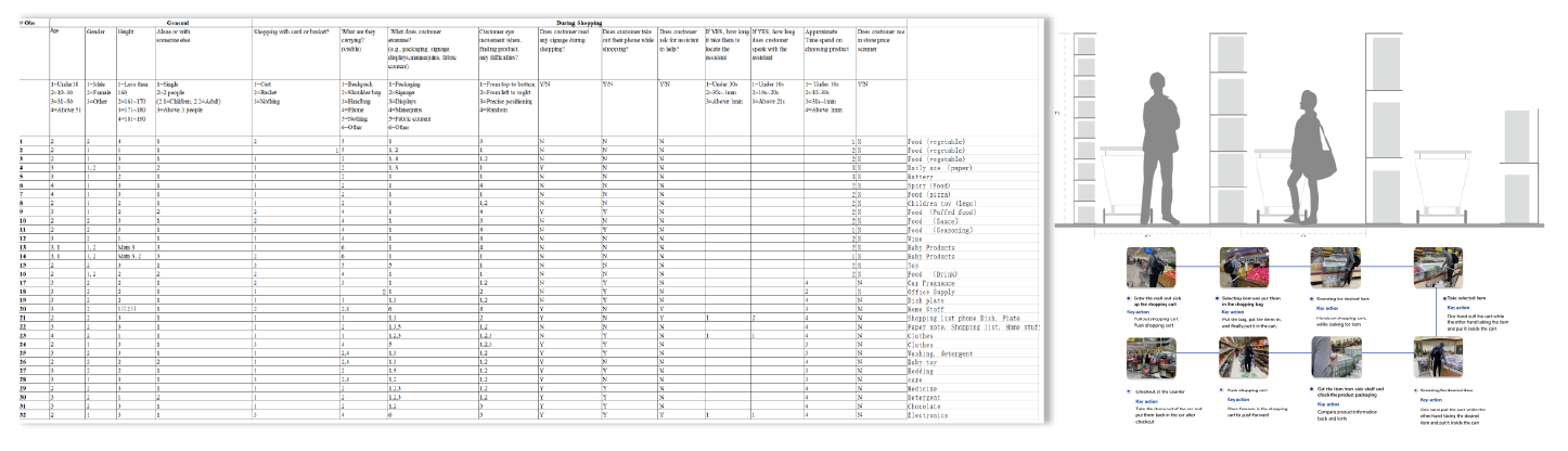
Observation
The Observation is mainly for user behavior in in-store shopping behavior. We designed very detailed observation sheet. Other than that, we make a measurement of the shopping cart dimension. We also created the user shopping diary to find more user behavior about the shopping behavior.
Online Survey
Online Survey help us user’s point of view of different shopping related aspects.
Based the survey, we have a broader understanding of the current shopping behavior in grocery stores.
We also learned about current shopping painpoint faced by the user and the potential design features that we may explore more with our design

Key findings

Which of the following difficulties you have encountered during your shopping experience? ( Select all that apply)
Imagine you have a smart shopping cart in the future, which of the following features you want it to have in order to provide a better shopping experience? ( Select the top 3 features)

User Journey Map + Service Blue Print

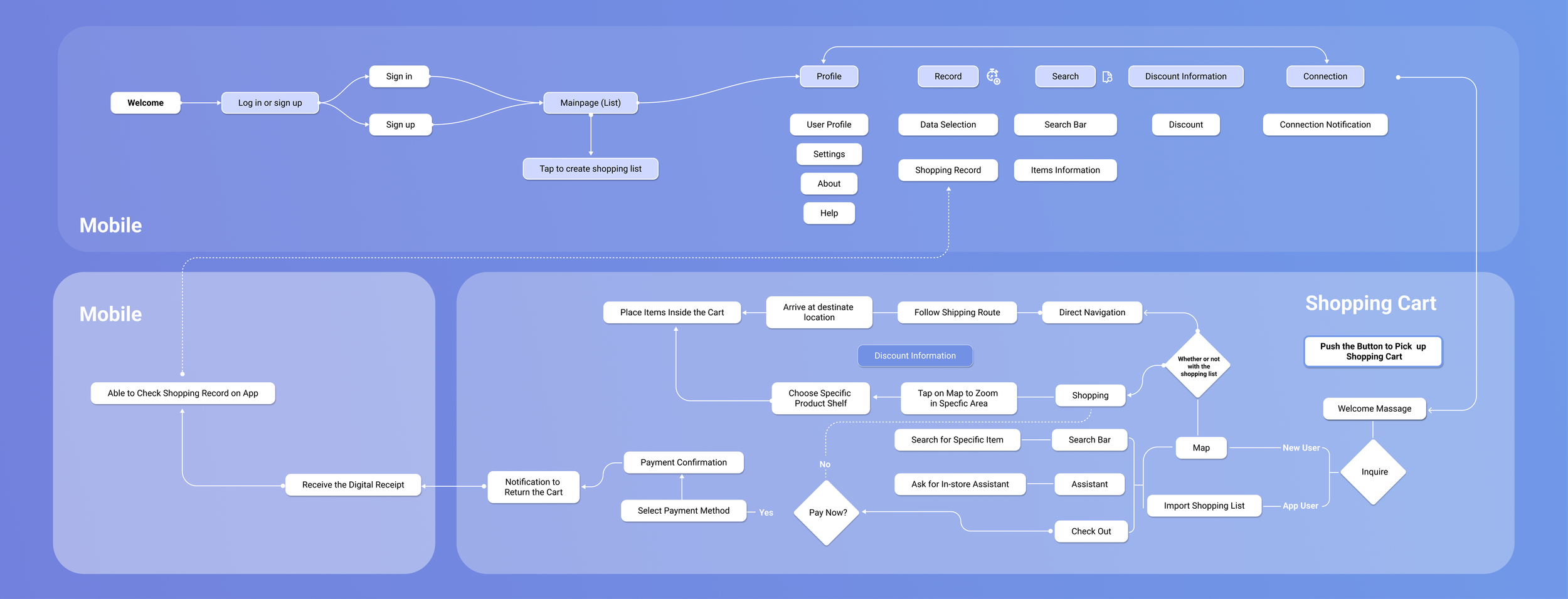
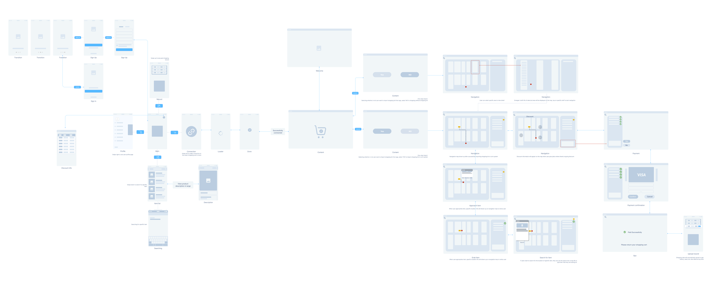
User Flow
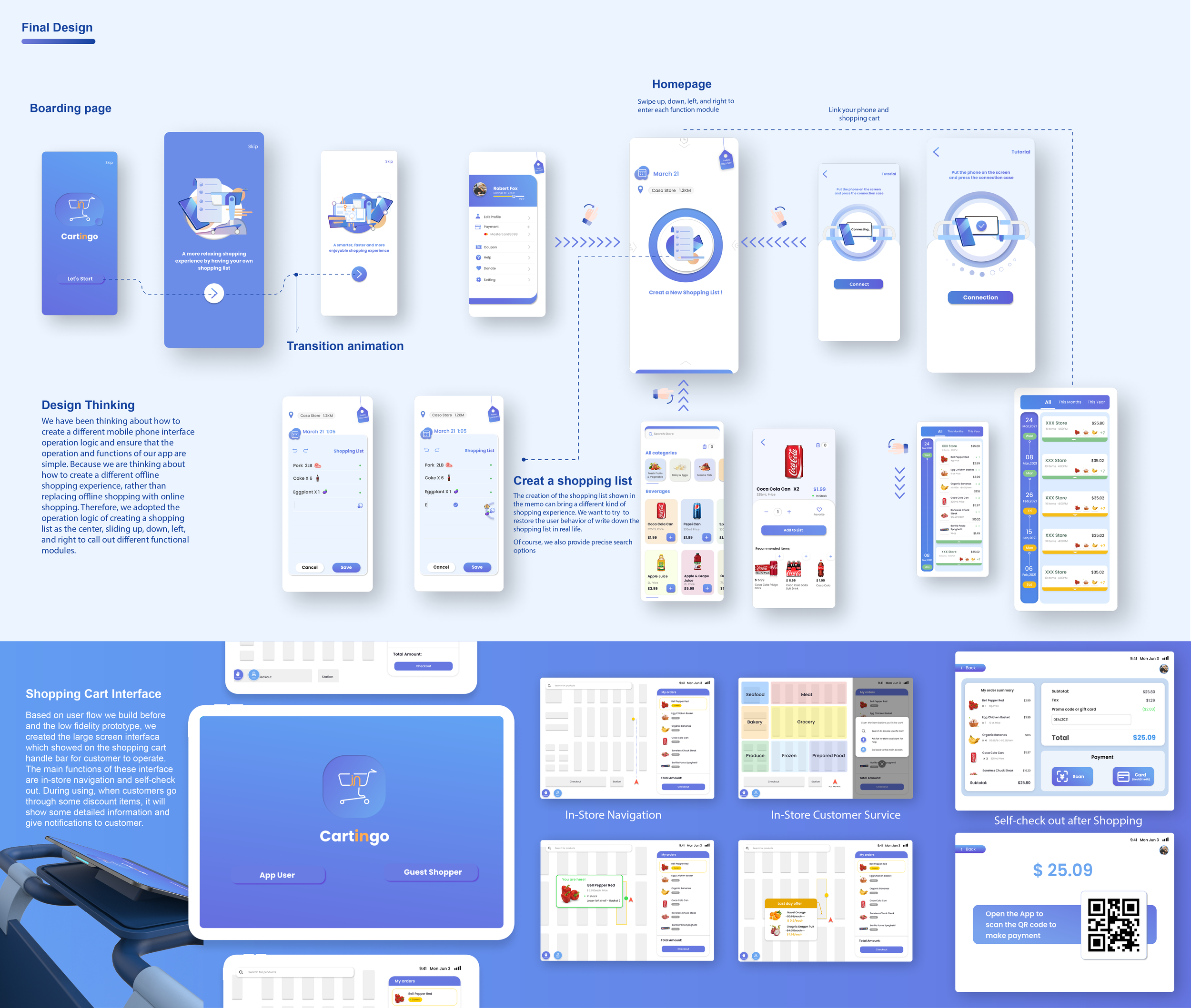
Low-Fi Prototype
App
Storyboard
Based on user journey and the service we try to build. We use service blue print as a tool to help us further clarify the details of the whole service system. Through building this kind of system, the design of both digital product and physical product become more clear.

Based on the service we wanted to provide and the definition of the product. We thought about the processes involved in the user interface. The user interface will consist of two ends, the mobile and the shopping cart, interacting with each other. Functionality will include dumping shopping lists, searching for products, self-checkout, and so on.
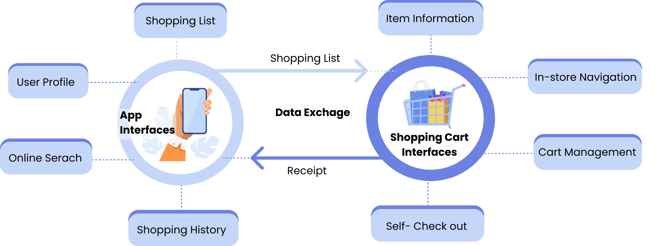
Shopping Cart Interface
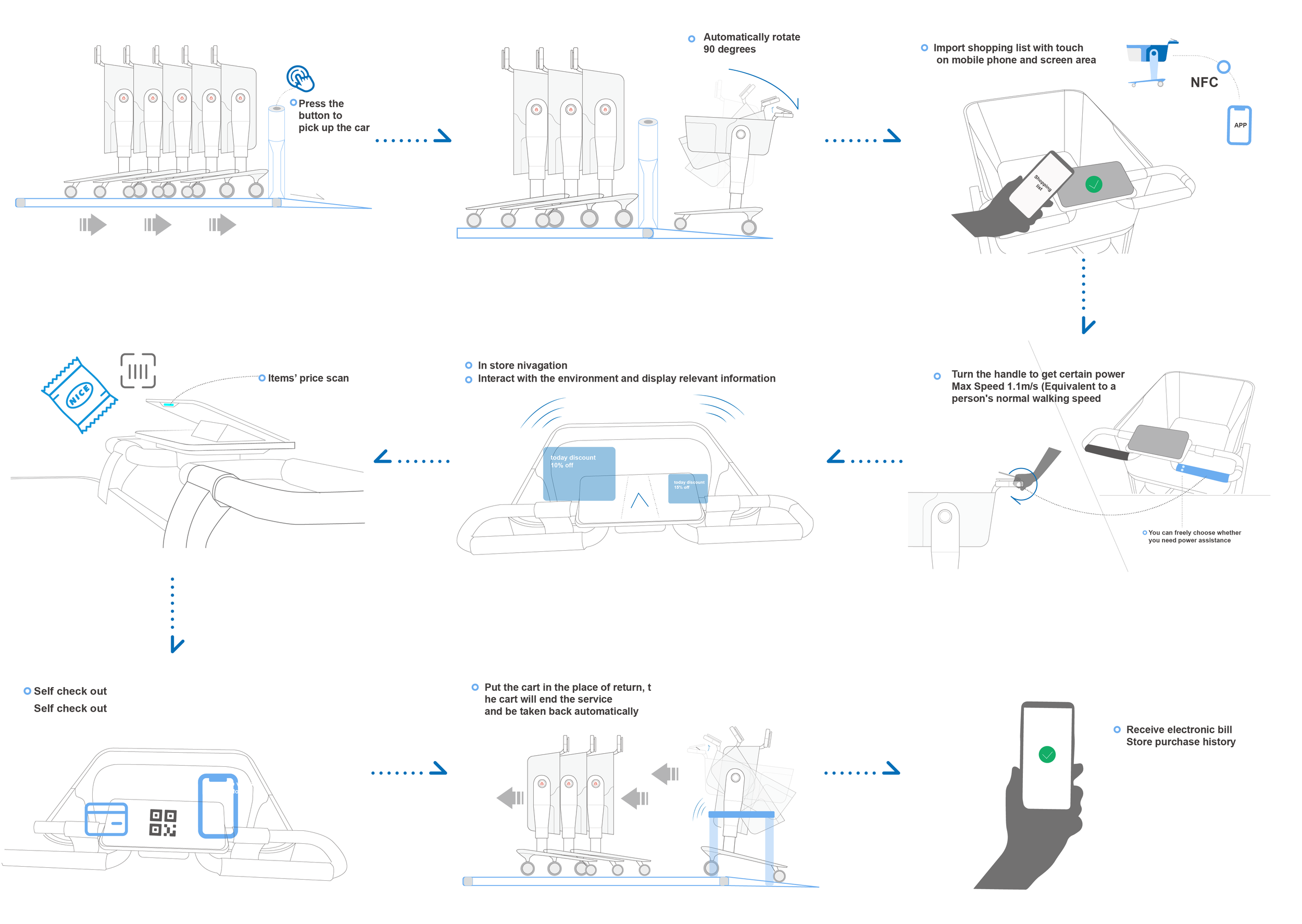
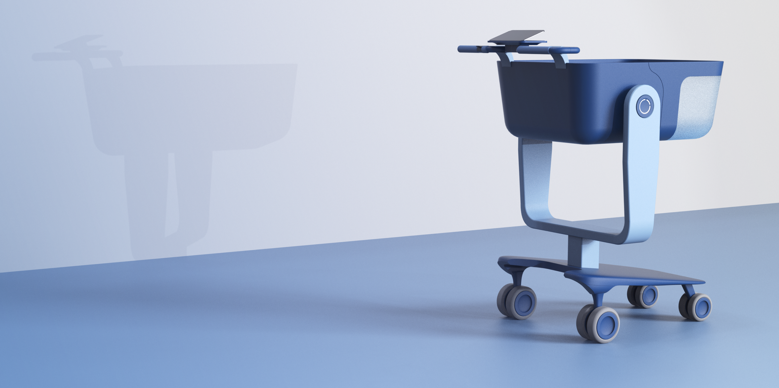
Shopping Cart Design Concept
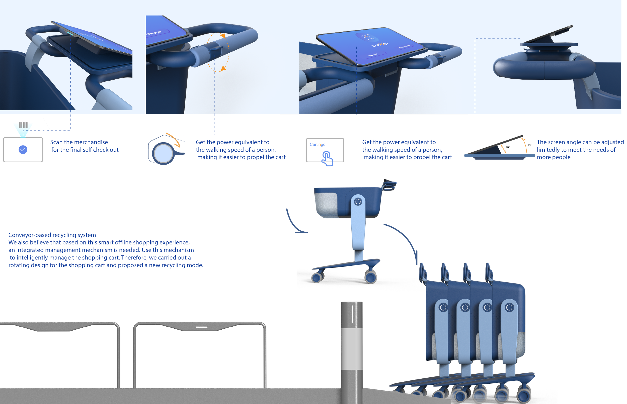
Storage Design
User Testing Report

Executive summary
Problem Statement
Online shopping attracts a large number of consumers that provide products through the internet and web browsers. Consumers can receive the product from specified locations in the meantime by selecting products according toprescribed specifications, ingredients or instructions. However, there is problems such as higher risk of fraud, lack of inspection, item may not work properly or defected, not be the same product as item pictured.
Connecting offline and online experiences continues to be a major focus in recent years with many brands trying to bridge the disconnect in order to deliver more seamless experiences. There is the current consumer trends: connecting in-store and online shopping experiences. In that case, shopping in a store should offer the same experience, information, and product choices as shopping online.
Proposed solution
Customer easily manages the shopping list in mobile application according to preferences
Easy in-store navigation to locate specific item
Keep track of the items on shopping lists
Eliminate time-consuming shopping process and quality of services issues
Self-checkout service to be time-efficient
Shopping information sends to the server wirelessly and automatically generates billing
Value
Optimize and re-define in-store shopping experience
Visualization of product information
Thinkings about interface design based on user shopping behavior
Provide customers with seamless in-store shopping experience
Provide not only the product but only the service for customers and commercial business
Project Overview
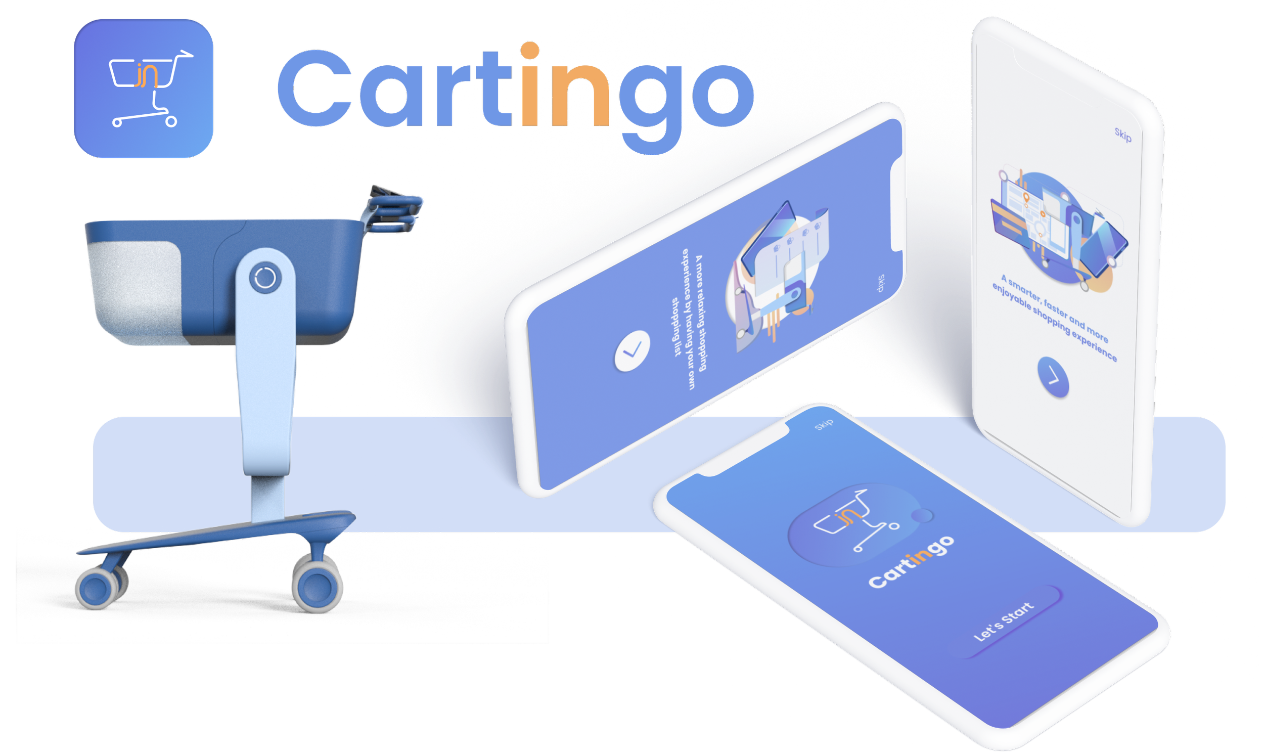
A seamless experience for consumers who is able to transition smoothly between online discovery and offline purchases through the design of the new model of the smart shopping cart with interactive features. The design engages people in a meaningful experience that merges context, content, along the customer journey in offline shopping
Testing Task Protocol
We performed user task based on the protocol

Testing Task Protocol
We performed user task based on the protocol


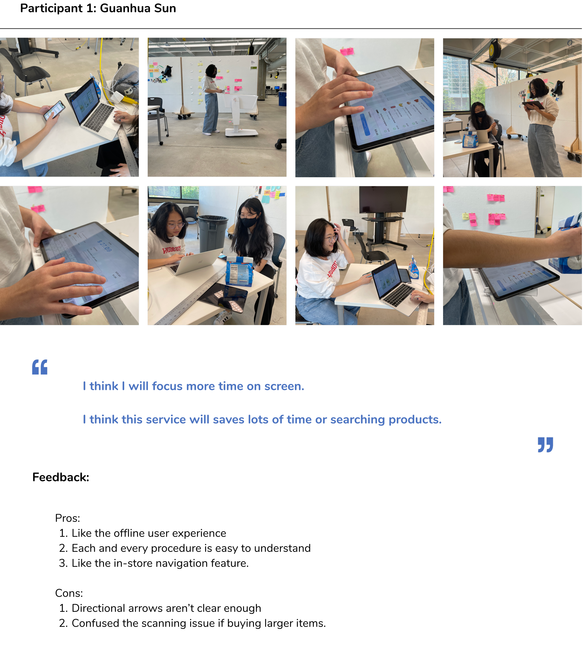
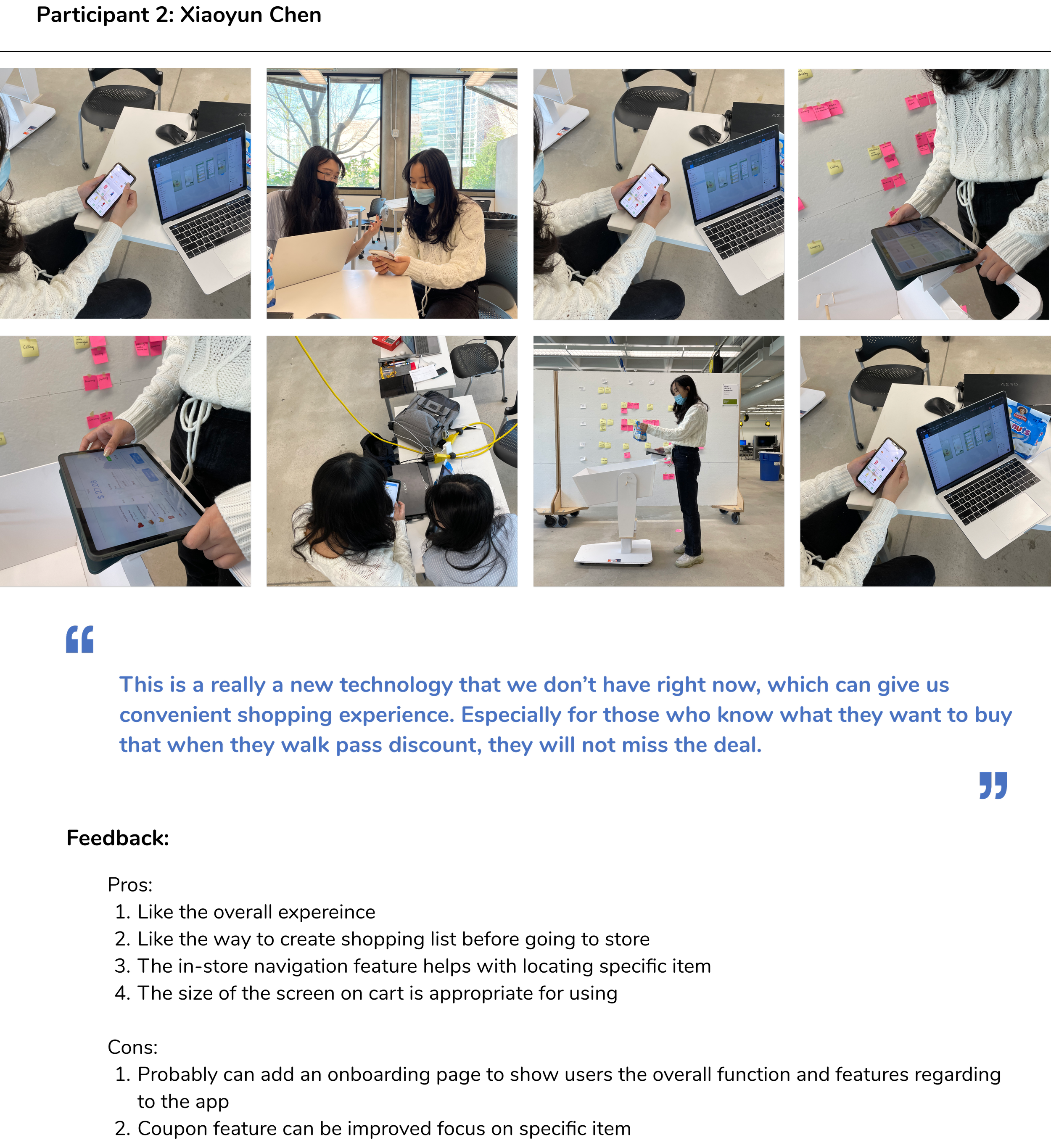
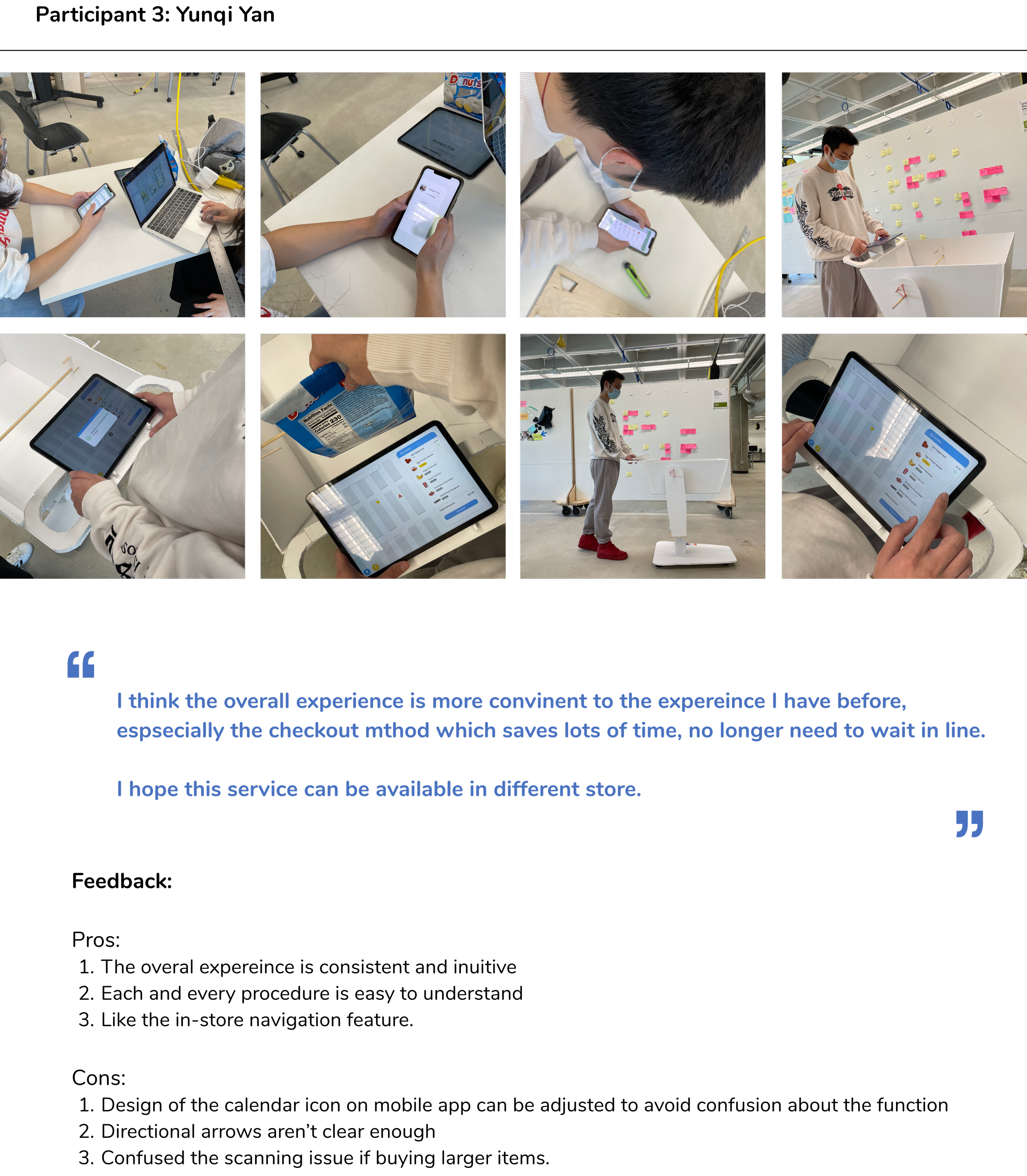
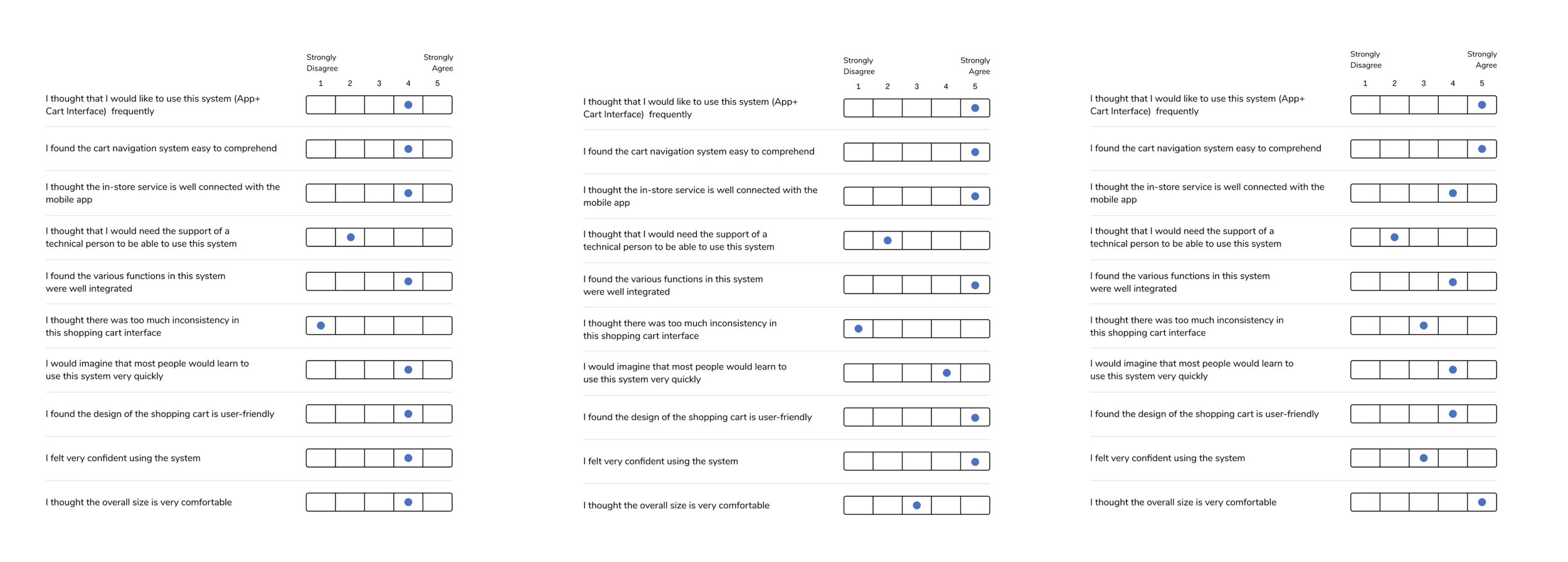
Usability Evaluation
After the users complete the tasks, they were asked to rate on the evaluation questions about their experience with the prototypes (digital+physical). Their responses are recorded with corresponding scores (1 to 5).
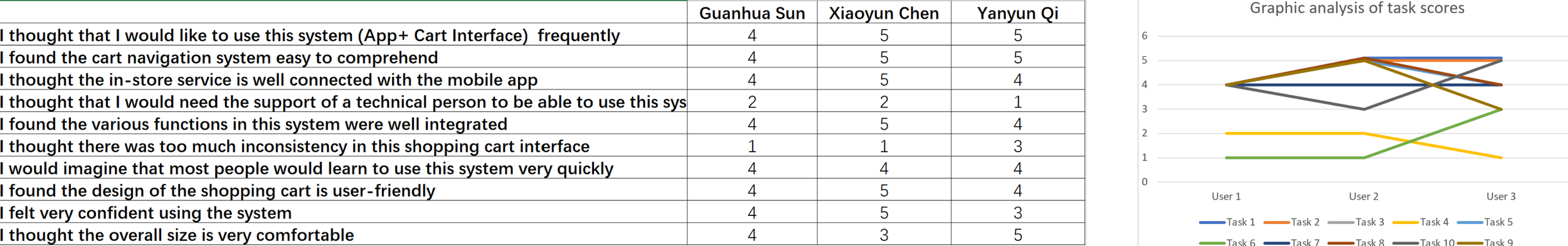
Data Analysis
We collected the usability test questionnaire's data with ten questions ( 8 positive questions and two negative questions) about UI and product design. Overall, the data is relatively consistent. Most of them agree that the whole design is reasonable and user-friendly. However, several questions show some differences, which deserves further analysis.
In the question about inconsistency in shopping cart interface, even two evaluators think the cart's information of user interface is relatively consistent, still have one person think the inconsistency of information is intermediate level. For the question about the “overall size of the shopping cart” and "feel confident of using the system", the answers are also come from mid-level to high-level. Compared with some feedback from interviews, we can find some relevance between them.
Key Findings
According to some test participants' feedback, in the UI part of the phone, some information is not displayed very consistently, which may cause misuse. In addition, since the interaction mode of the cell phone interface is not so much like the traditional one, some participants felt novel and at the same time thought that some guiding tips were needed, including tips on connecting with the vehicle and thinking about improving the correlation between the two different UI interfaces.
Some bugs were found in the test. The prototype itself had some problems due to limited preparation time. For example, due to the soft material, the car loosened after one or two pushes, making it difficult for the testers behind to push. In addition, when the screen was put on, it still could not bear the weight well because the material was too soft and light.
However, through a number of tests, we were able to determine the reasonableness of the screen size, height, and shopping cart dimensions. We could find that the current UI prototype is still reasonable through interaction testing and provides a complete user experience. However, many details of the design deserve more thought, such as the consistency of information visualization.
Discussion and Takeaways
Based on the user evaluation and data analysis, the feedback at this stage reinforce our understandings of user needs which helps us to better design our product to solve the problem. Those feedback became important reference data to guide us to make improvement on our current design.
From the user evaluation, we learned:
Analyze and make use of data and feedback. There weren’t lots of data that we've acquired, but how to analyze it and gain the key findings are important
Future Development
Make adjustment of app/screen interface design based on user feedback
Work on the onboarding screen to allow the user to be familiarize of the general function
Reinforce the user flow connection between the app, the cart screen and the acutally shopping cart