

Design Outcome

Problem Statement & Objective
This website is mainly about a learning platform for the 3rd-part partnerships to get training about the GEA Air & Water Product.
Objective: Redesign the Home Page, Back End Management Page, Course Registment Page, and Video Page.
The current website design is based on a third-party Learning Platform with low customized features, There are growing need to improve website UI design with better user experience.
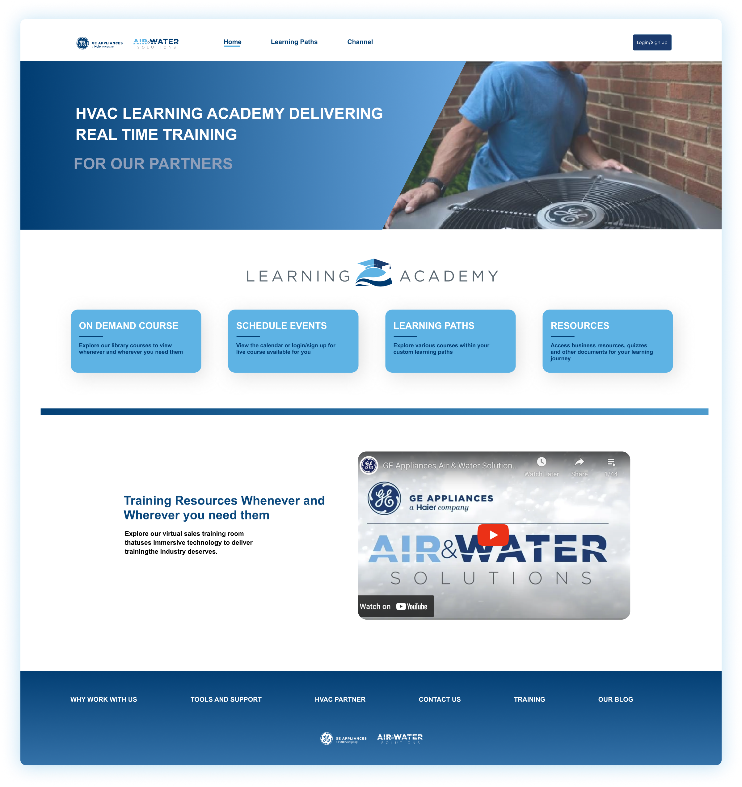
My work: website has been published: Home Page. Other Pages’ concept design for potential use.
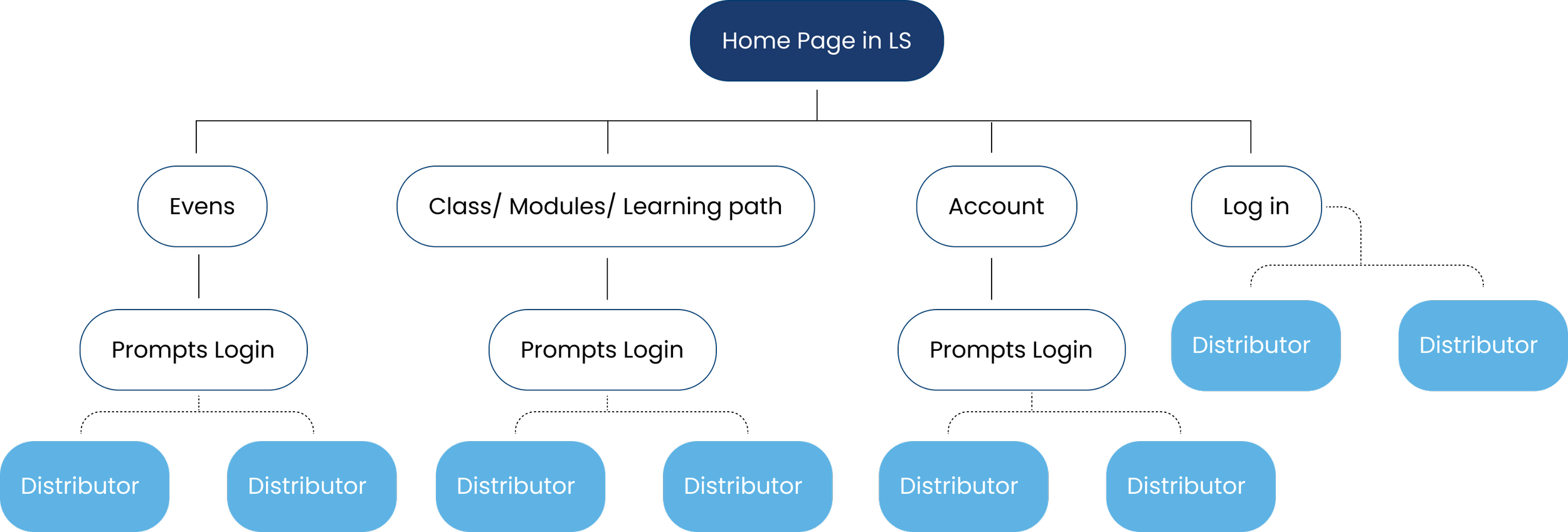
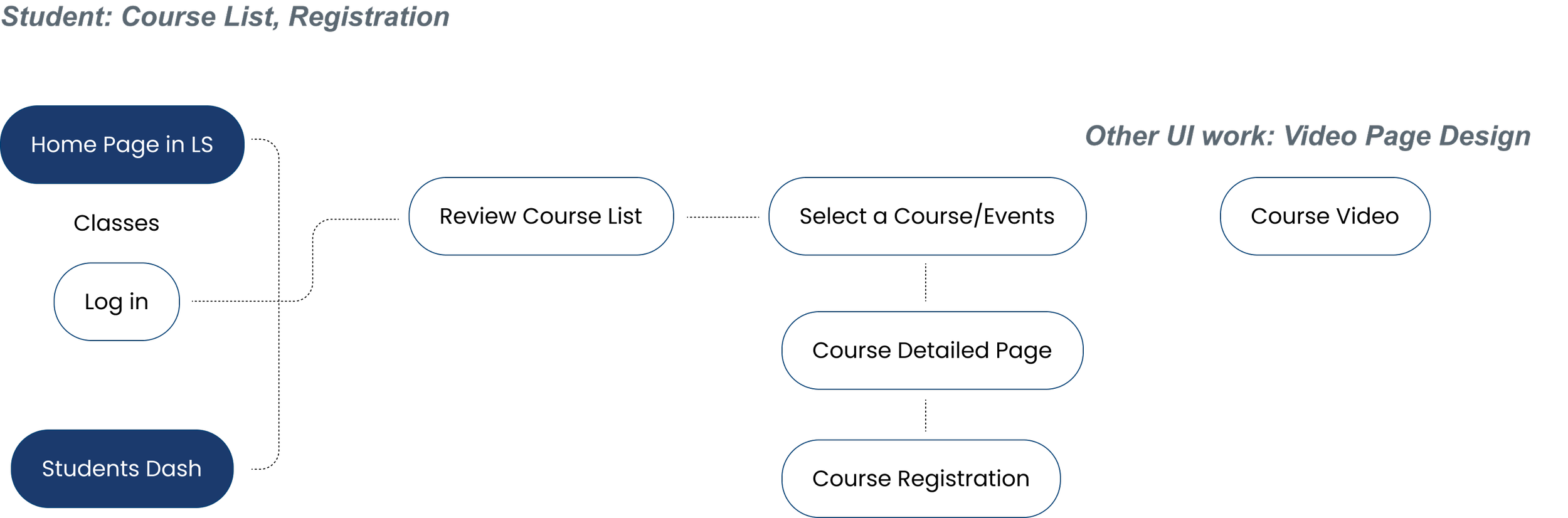
The Simple User flow has beed defined
Specific Design Task:
Design Requirements:
Home page redesign, follow the ß guideline of GEA A&W.
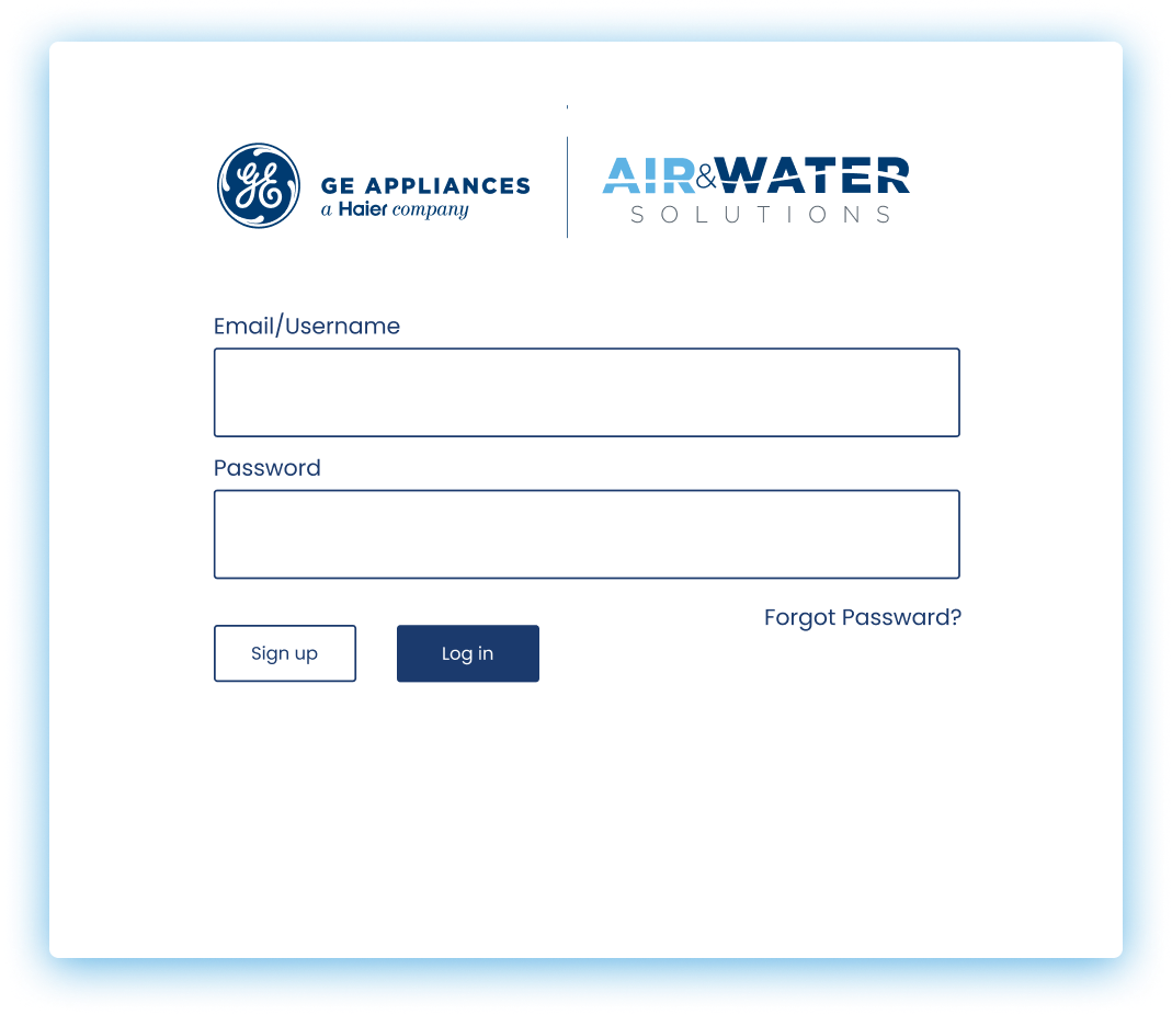
Log in Pop up interfaces.
Course Registration Process. Incouding Email Confiramation
Course Video Interfaces: With basic video page features. Thinking Basic learning website founctions
Student Managements Page, Course Information edit Page
Improve the UI Design and better UX experience
Keep the Website simple and clean.
Easy access for both students and managers
Keep the basic layout design ( Most)
Step 1: Reorganize User flow I need to work with
Since the work I need to address is not encompassing the entire website design, my design process primarily revolves around clarifying the specific user flow that requires attention. Following this identification, I am tasked with designing interfaces that align with this particular flow.


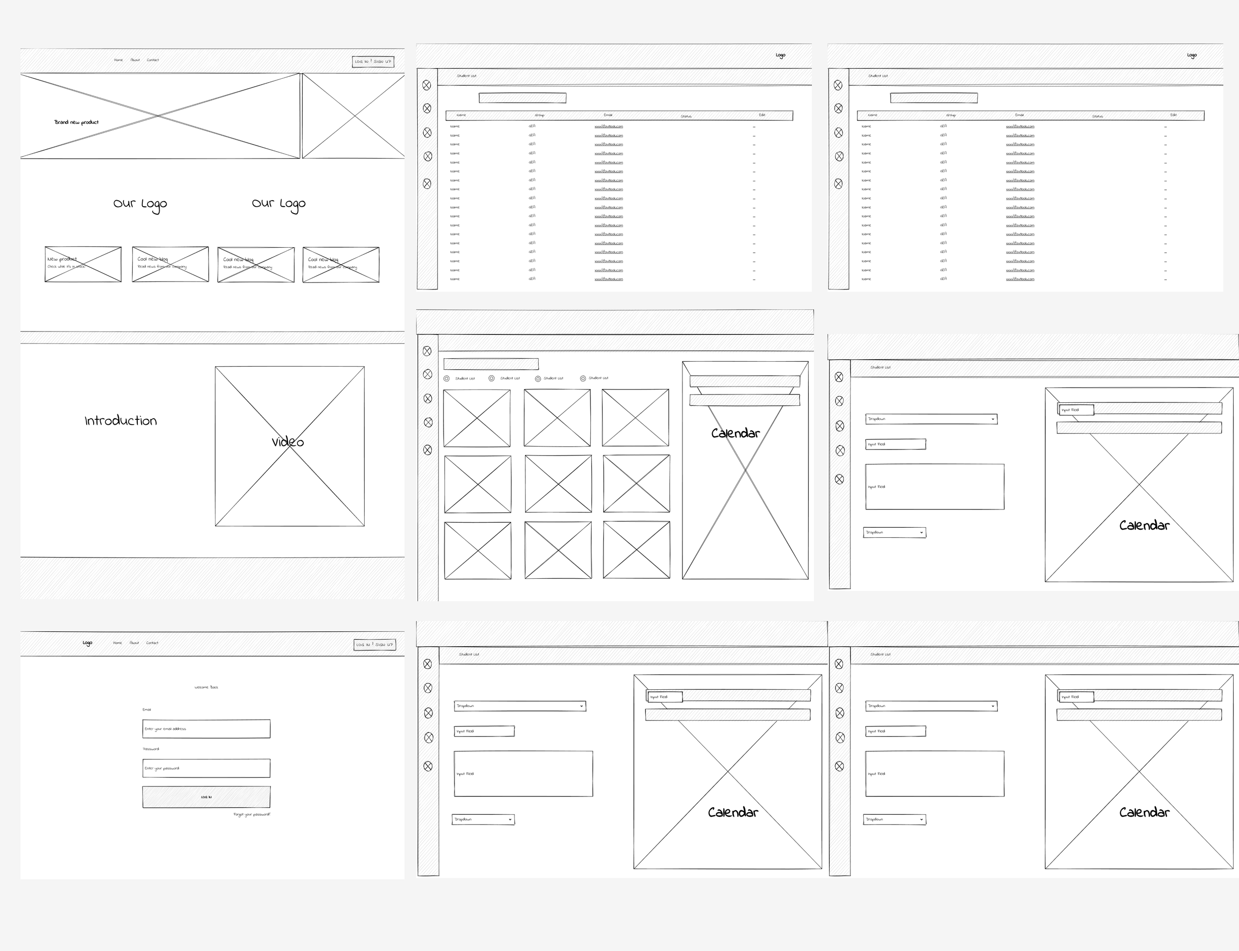
Step 2: Low-fi Wireframe
Despite encountering numerous design constraints, a comprehensive examination of the interface was initiated, commencing from a low-fidelity standpoint. The low-fidelity interface was predominantly developed in accordance with the three user flows highlighted earlier.
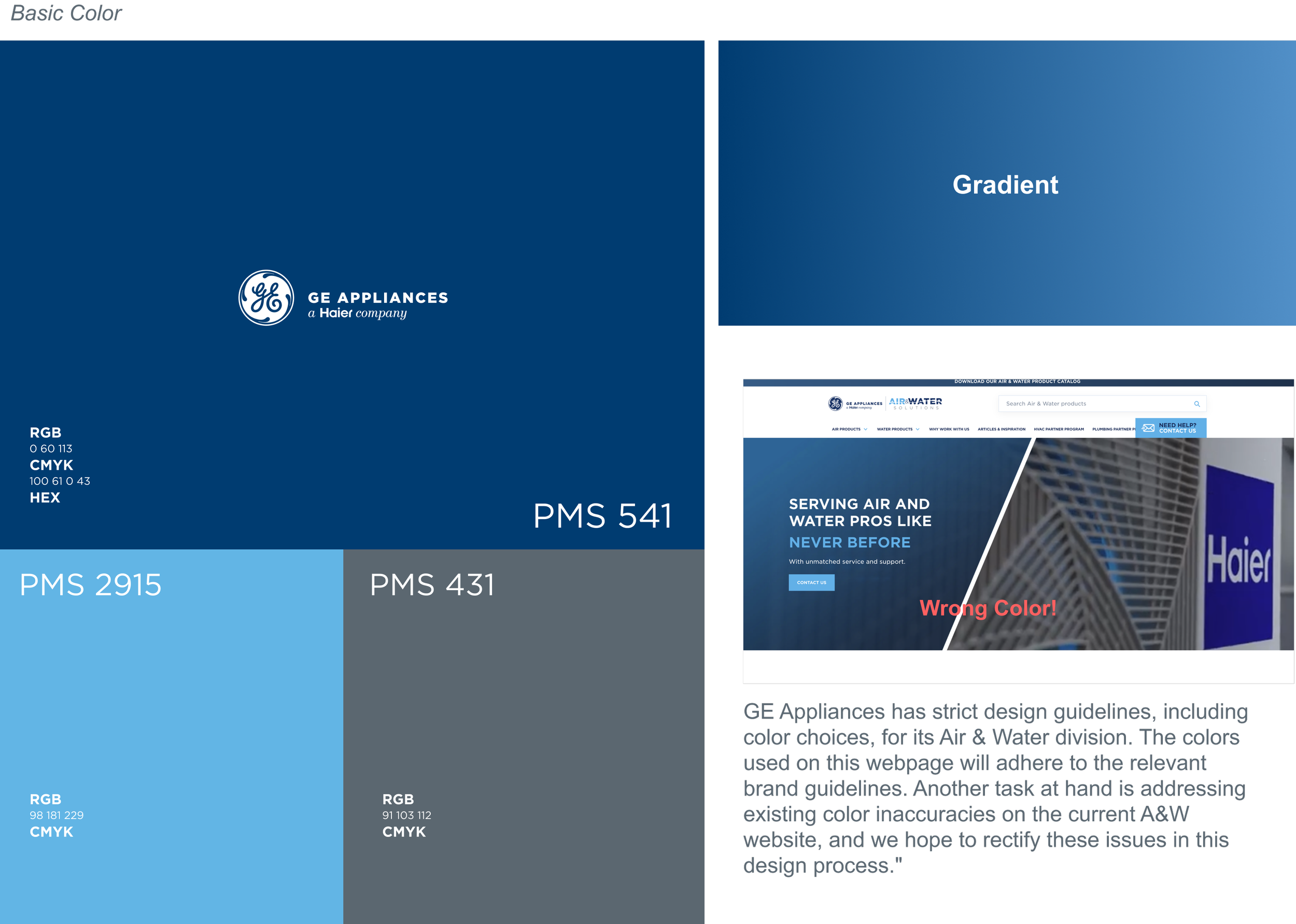
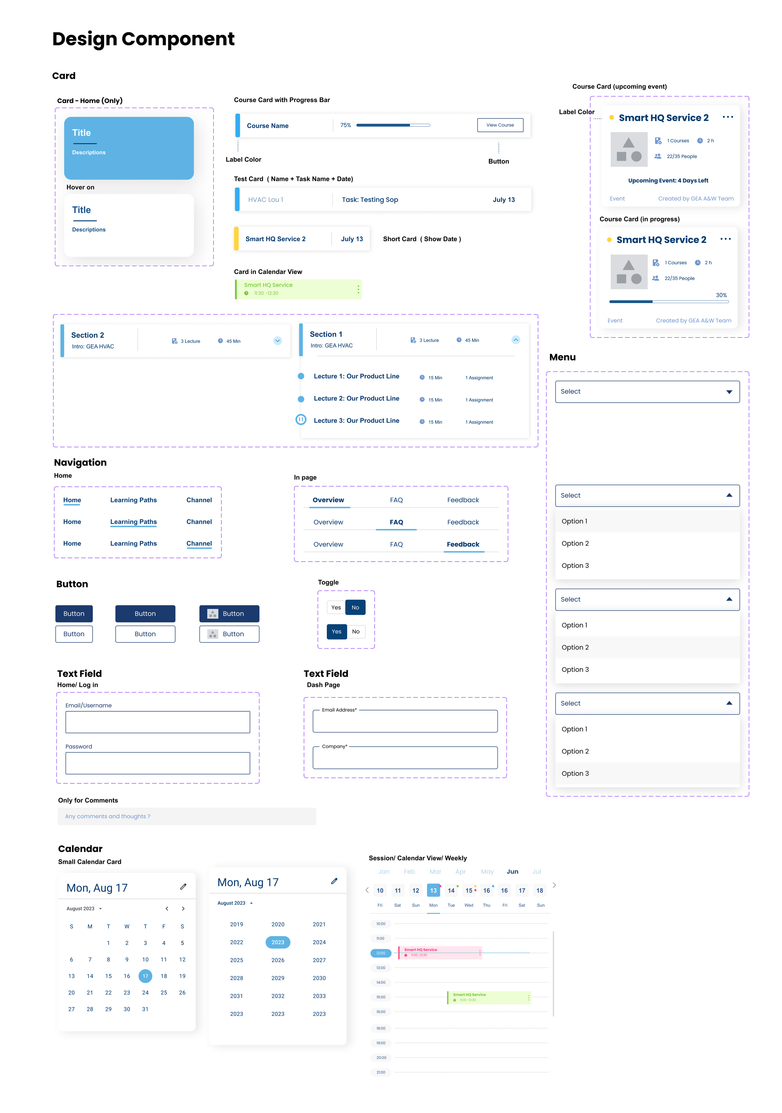
Step 3: Develop design system based on design guideline of the GEA A&W Team
Step 4: Initial Hi-fi Prototype and Usability Testing
I created a fully-functional, high-fidelity prototype of the new flows using Figma. At the same time, we started recruiting subjects for the test who fit our criteria. We did 4 usability tests in the first round and 3 after iterating on the issues that we’ve identified:

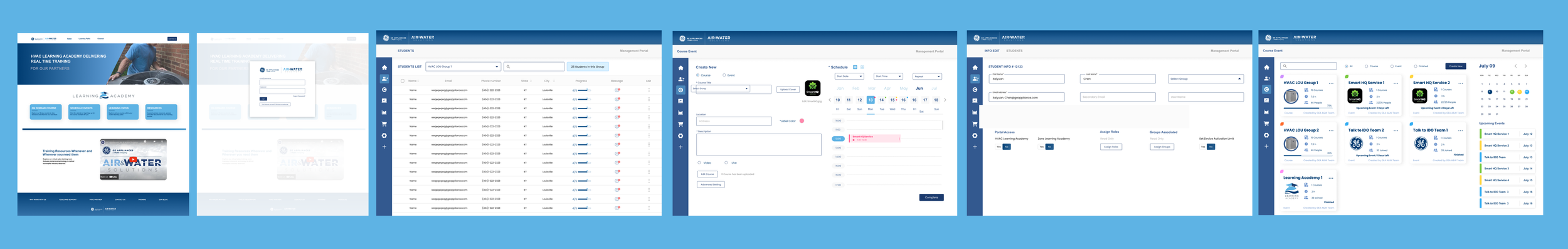
Final Design
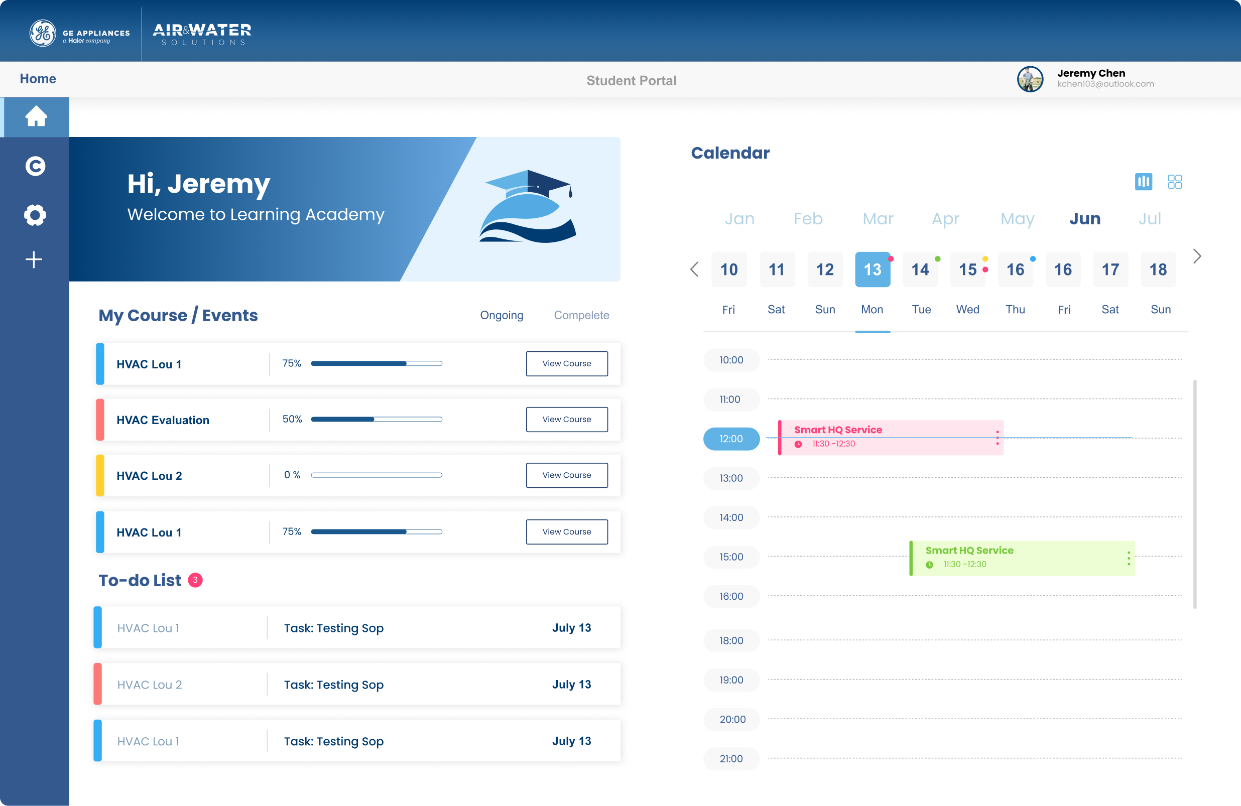
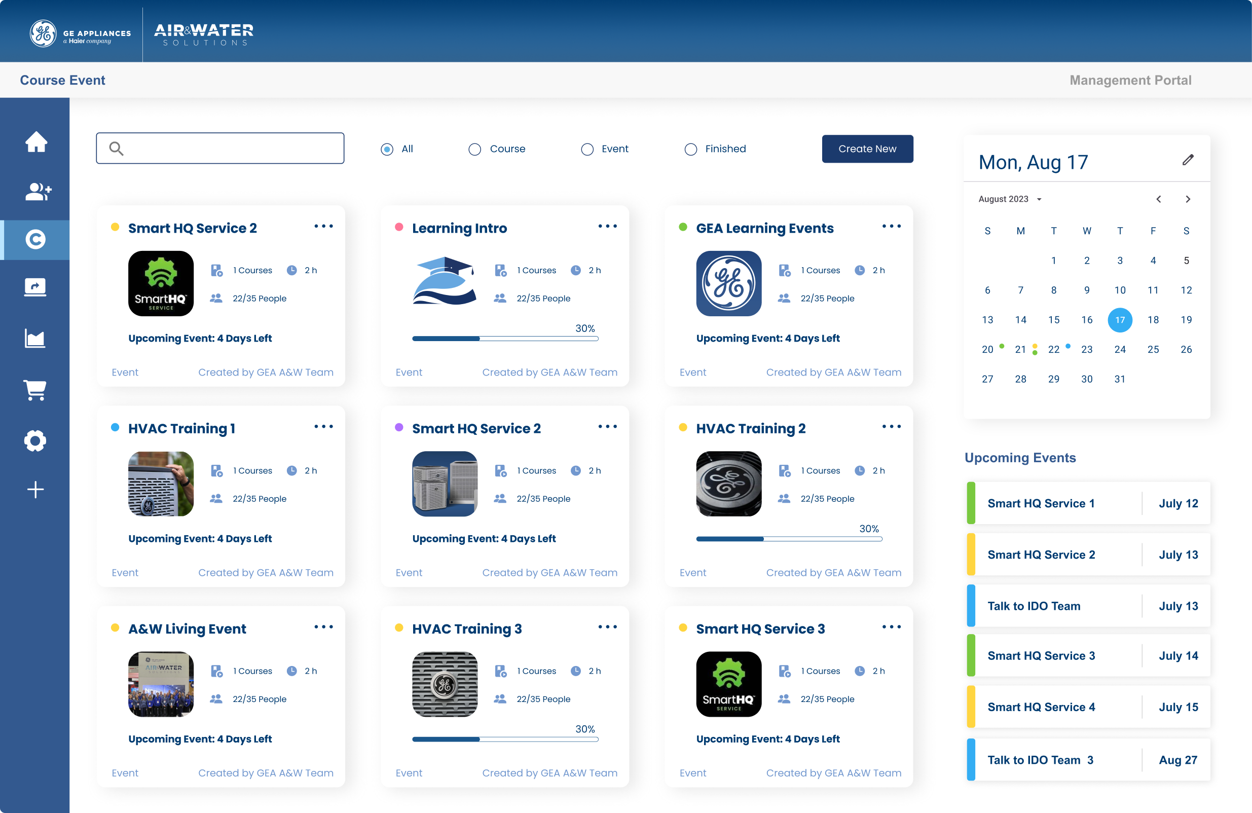
Student Dash—Course Description
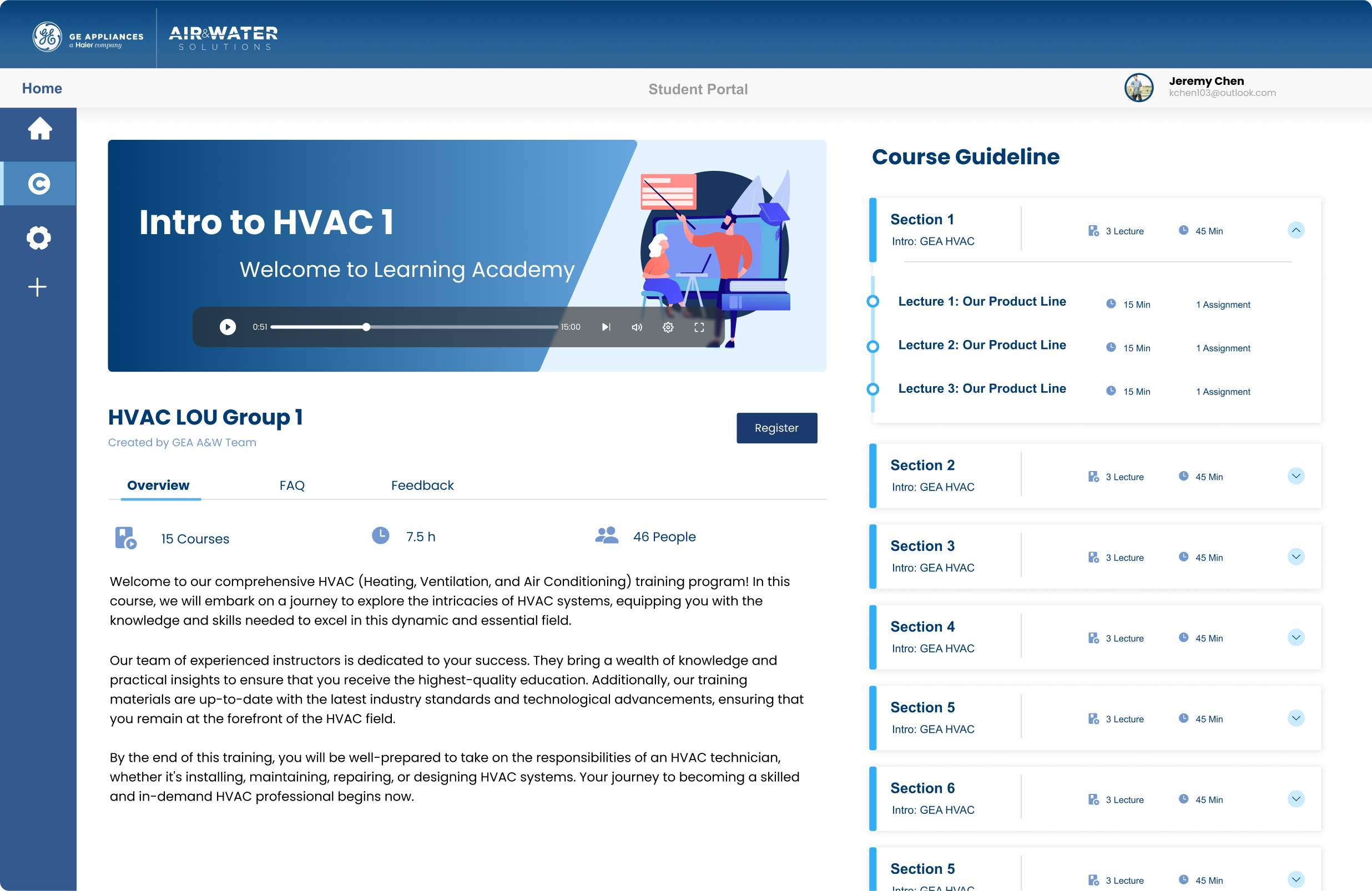
Course Video Page

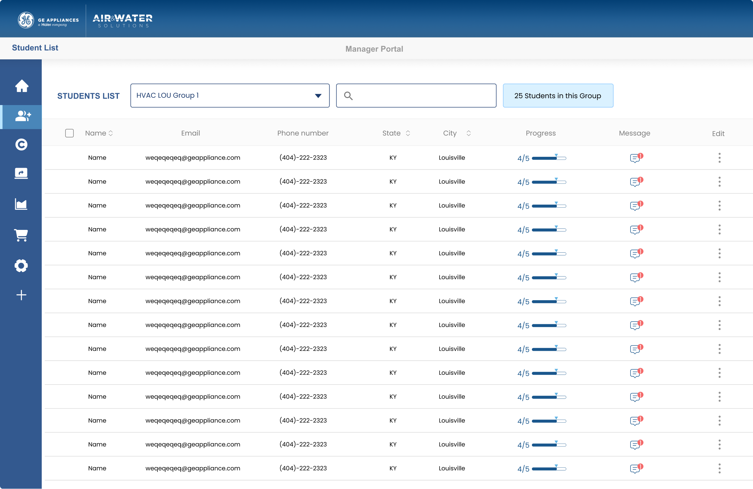
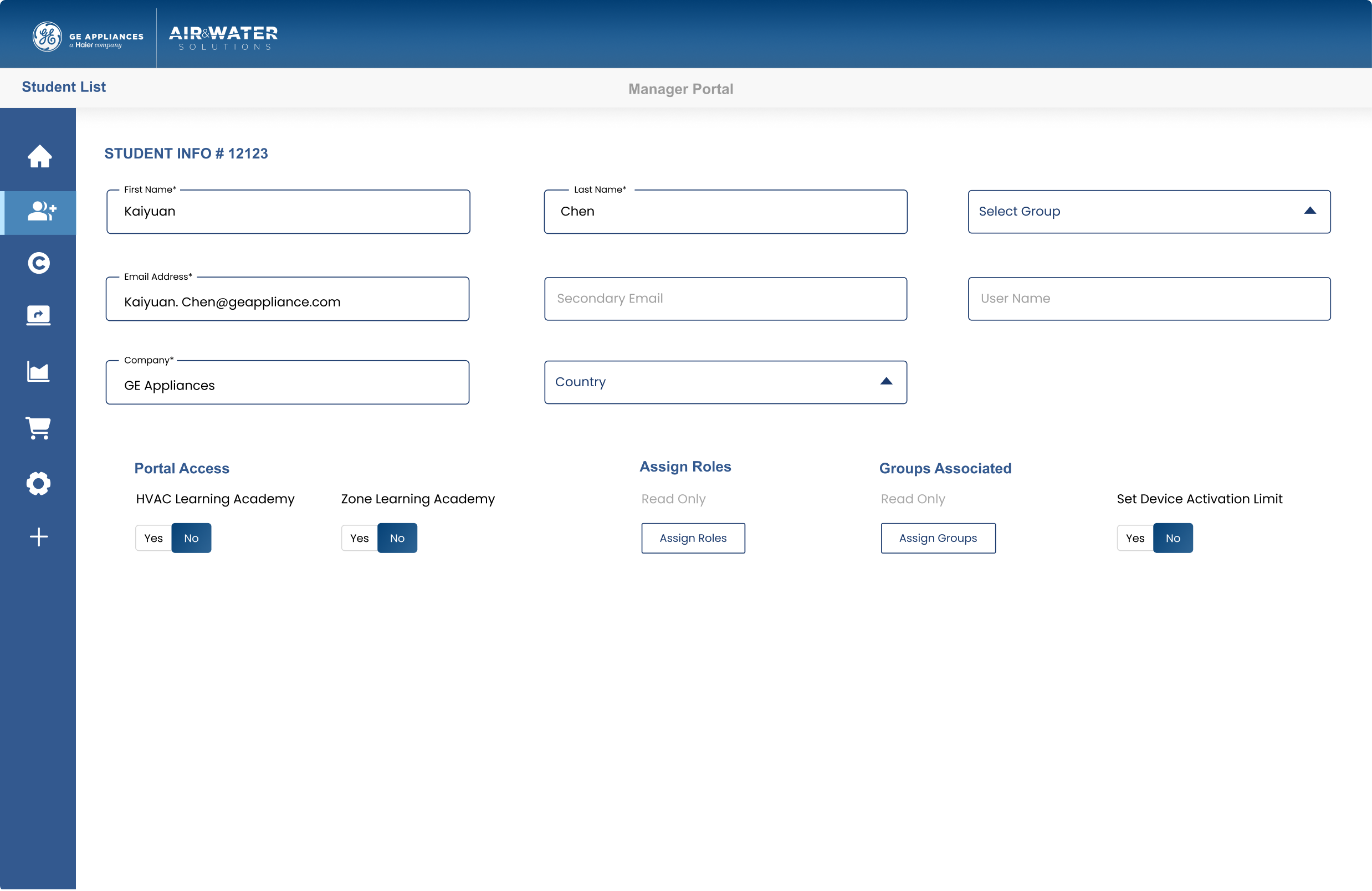
Manager Page: Student List—Edit Information
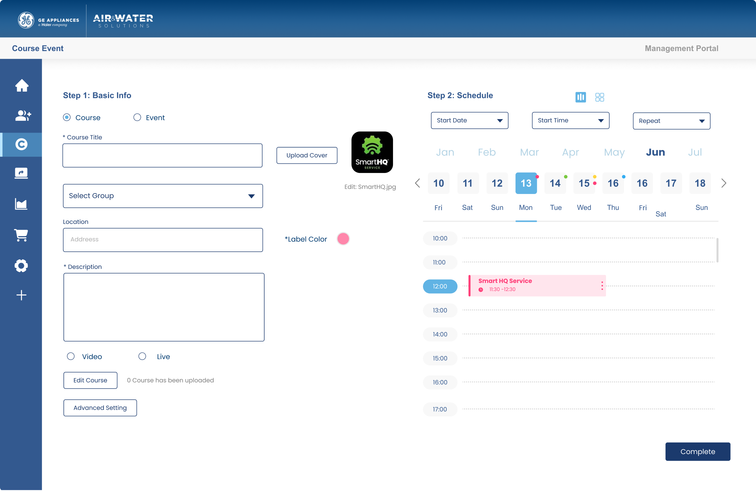
Course Overview — Create a new course/event
Takeaways
Cooperation between different departments:This time, is the collaboration between the GE Appliance IDO Team and the Brand Team. Understanding their respective design requirements and effectively implementing UI design based on the brand's visual identity is an intriguing challenge.
In addition, this is a unique task. I don't need to work on the entire user experience but rather create interfaces based on the existing user flows for the entire department to evaluate and follow up on. This has led me to think more about how to make the entire design more systematic. Standardizing the design system has been a significant challenge for me and has provided me with valuable learning experiences.